
Column charts
- useful for showing data changes over a period of time or for illustrating comparisons among items.

Line charts
- display continuous data over time, set against a common scale, and are therefore ideal for showing trends in data at equal intervals.

Pie charts
- show the size of items in one data series, proportional to the sum of the items. The data points in a pie chart are displayed as a percentage of the whole pie.
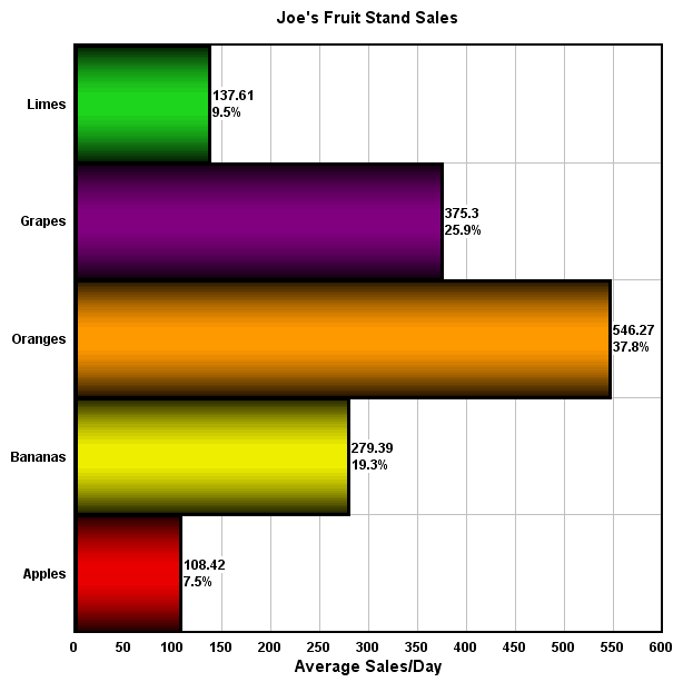
Bar charts
- illustrate comparisons among individual items.
When to use:
• The axis labels are long.
• The values that are shown are durations.

Area charts
- emphasize the magnitude of change over time, and can be used to draw attention to the total value across a trend.
Sources:
http://moodle.pshs-brc.edu.ph/
office.microsoft.com

Walang komento:
Mag-post ng isang Komento